Upwell's Spike Quantification of the Ocean Conversation
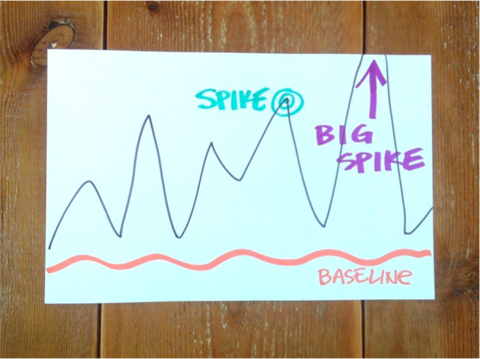
What is a Spike?
A spike is a significant increase in online attention for a particular topic. When you graph those social mentions, you can actually see that burst of attention ‘spike’ the graph -- hence the name.
We have been observing spikes in the wild, so to speak, since the beginning of Upwell. It’s a concept that is at least somewhat familiar to anyone who has ever described a video as “viral,” or checked out the list of the most shared articles on The New York Times' website. A lot of people, sharing one thing, over a short time, creates a spike. In the world of Big Listening, that one thing they share can actually be a large number of different things on the same topic, but the general point remains the same. Surges in attention create spikes. So how do you measure one?
Let’s look at a graph of the sustainable seafood conversation from Summer 2012:
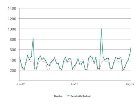
Social mentions for Upwell’s Sustainable Seafood keyword group vs. Upwell’s Sustainable Seafood Baseline, June 1, 2012 - August 1, 2012.
It seems pretty clear that there are two spikes in this time period. One appears on June 8, the other on June 16. But what about the other days? How far above the Baseline does social mention volume have to be in order to qualify as a spike? We set out to find a way to compare spikes that would answer the question.
Before we dive in, it’s important to note that social mention volume for a given day is a construct. We decided to use a day as the operating unit of time both because the tools we have available to us use that temporal distinction, and because a day as a unit of measurement is widely understood. That is not to say that one couldn’t decide to measure spikes by the hour, by the minute, or by some other amount of time. We made a conscious decision to build our initial definition of a spike around the day, but infinite other options exist as well.
A second caveat is that focusing on spikes may obscure what is actually making up the long tail of post volume. Upwell talks about, and quantifies, much of this activity as the Baseline, but there may be other small-to-medium bursts of attention that last more than a day and consequently don’t visually ‘spike’ a graph in the same way (think of a multi-day increase in attention as a hump or a mesa, rather than the taller, more angular spike). Spikes look good on charts, and they help push conversations into the wider internet, but they are not the whole story of an online topic. We long for a day when tools for Big Listening allow us to view topic volume graphs like geologists look at cross-sections of rocks -- that day is not here yet.
With those caveats out of the way, we can return to our earlier question: what is a spike? Remember from our discussion of Baseline quantification that Upwell’s analysis is designed to inform a set of interventionist activities. We:
- identify and target high-value items to campaign on;
- compare the relative size of different ocean sub issues (e.g. sharks vs. whales); and
- measure the impact of our campaigns.
Spike quantification informs our campaigning and provides one measure of results. We’re not interested in just contributing to the noise around a given ocean topic, we actually want to help a signal to emerge. Spikes are those signals. Evaluating opportunities to campaign becomes a much more concrete activity when you know exactly how many social mentions are needed to break through the regular volume of conversation.
After examining historical social mention volume for our Sustainable Seafood and Overfishing keyword groups, we calculated a variety of statistical thresholds for the exported data and compared the results to our measured campaign and spike data. As discussed earlier, Upwell’s Baseline calculations are derived from the insight that our primary ocean topics each demonstrate a weekly periodicity. Similarly, in calculating potential thresholds for what constitutes a spike, we started with that same insight and then calculated various multiples of standard deviation above the average (mean) value for that day of the week. Because standard deviation measures how spread out the values within a data set are, using it to measure a particular value’s variation from the “normal” value of that data set is a good way to test for a spike. Spikes are visible because they’re outliers, and that’s what the standard deviation threshold(s) tests.
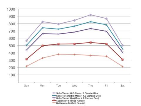
Day-of-the-week values for the Sustainable Seafood Baseline, along with the Sustainable Seafood mean, and mean +1x, +1.5x and +2x standard deviations (10/17/11 - 1/29/13).
As seen above, the standard deviation thresholds are higher than both the Baseline and the mean. Graphing those thresholds against our campaign and event records revealed that the one standard deviation threshold was the most accurate representation of what we were observing on a day-to-day basis.
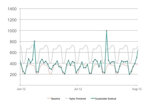
Social mentions for Upwell’s Sustainable Seafood keyword group vs. Upwell’s Sustainable Seafood Baseline vs. ‘Mean + 1 Standard Deviation’ Spike Threshold (June 1, 2012 - August 1, 2012)
Upwell defines a spike as occurring when the social mention volume for a given day meets or exceeds one standard deviation from the mean of all recorded values for that same day of the week.
While a critic might accuse us working backwards to find the threshold that gives the best fit, we would actually agree. Sustainable Seafood and Overfishing are the topics that we know the best -- because we’ve monitored them and campaigned on them with the most focus -- and we were looking for a metric that would have practical implications for attention campaigns. As mentioned before, we remain open to other spike quantification approaches, but this one is our preferred option, given what we know right now.
What Does Spike Quantification Tell Us?
Upwell’s spike quantification methodology is in alpha, so to speak, and going forward we will look to improve it. The possibilities for more comparative measures of success are numerous. One thing is certain, however: applying a spike quantification lens to our work is illuminating.
Spike comparison beta methodology?
The following graphs show our first Winter in 2011 and most recent Winter in 2012 working in the Overfishing and Sustainable Seafood conversations. Both one standard deviation and two standard deviation threshold lines are included for reference.
The comparison in time periods for both conversations is dramatic. There is a noticeable increase in spike frequency (the number of spikes), spike volume or “spikiness” (see: the number of spikes exceeding two standard deviations), and in the overall volume of conversation in the time period as measured against the Baseline. To be blunt: this is what success looks like.
Sustainable Seafood: Winter 2011
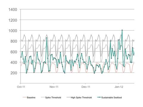
Social mentions by day for Upwell’s Sustainable Seafood keyword group, as compared to the Sustainable Seafood Baseline, as well as to spike thresholds of one standard deviation and two standard deviations above the day-of-the-week mean (10/17/2011 - 1/31/12). Total post volume: 45,255 social mentions over 107 days. Average volume / day: 423 social mentions.
Sustainable Seafood: Winter 2012
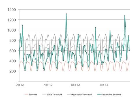
Social mentions by day for Upwell’s Sustainable Seafood keyword group, as compared to the Sustainable Seafood Baseline, as well as to spike thresholds of one standard deviation and two standard deviations above the day-of-the-week mean (10/1/2012 - 1/29/2013). Total post volume: 66,456 social mentions over 121 days. Average volume / day: 549 social mentions.
Overfishing: Winter 2011
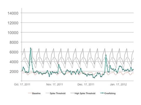
Social mentions by day for Upwell’s Overfishing keyword group, as compared to the Overfishing Baseline, as well as to spike threshholds of one standard deviation and two standard deviations above the day-of-the-week mean (10/17/2011 - 1/31/12). Total post volume: 211,799 social mentions over 107 days. Average volume / day: 1,979 social mentions.
Overfishing: Winter 2012
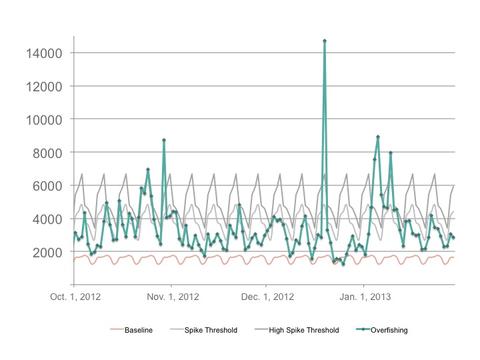
Social mentions by day for Upwell’s Overfishing keyword group, as compared to the Overfishing baseline, as well as spike threshholds of one standard deviation and two standard deviations above the day-of-the-week mean (10/1/2012 - 1/29/13). Total post volume: 409,692 social mentions over 121 days. Average volume / day: 3,386 social mentions.
***
We've spent the last six weeks reflecting on our pilot project, and want to share our results with you. This post is one in a series of pieces about what we've learned over the last 10 months.
If you like this post check out:
Upwell's Ocean Conservation Baseline Methodology
Upwell's Distributed Network Campaigning Method
Conversation Metrics for Overfishing and Sustainable Seafood
Add a comment